 Quick! Without looking down, what color clothes are you wearing today? Are they your favorite colors? What do you think those colors say about who you are as a person? These questions may seem pedantic until you consider that a study by the Institute for Color Research has found that upon viewing, a subconscious judgment is formulated about a person, environment or product within 90 seconds; and 62%–90% of that judgment is based solely on color.
People rely heavily on vision as their primary sense of the world around them, you can tell by the popularity of colloquial phrases like “what you see is what you get,” “a picture is worth a thousand words” and “beauty is in the eye of the beholder.” So when it comes to your business, visual perception of color definitely has an effect on your customer’s first impression of you and your products. Here are some insights that may help you envision or re-envision your shop’s concept to really capture your audience’s eye and appetite.

In art class, we learn about the different colors and how they relate to each other. There are primaries (red, blue and yellow), secondaries (orange, green and purple) and neutrals (black, white, gray and brown). Above and beyond these, there are tertiary colors (like yellow-orange or blue-green) and any number of other variations accounting for hue and saturation. These colors relate to each other on a color wheel (above) where neighbors are called analogous and opposites are called complementary. Colors can also be grouped into “families” such as warm (red, pink, orange, yellow) and cool (blue, teal, green). Purples and browns can transition between the two color families, depending on hue (think of warm fuchsia purple compared to cool periwinkle purple). Many successful color schemes are based on a palette of analogous and complementary colors that “work” or “go” together, often derived from combinations found in nature.
Before exploring the relationships between these colors, first we must understand that colors have meaning in and of themselves. These meanings are as much a result of our culture, heritage and generation as anything else, so it is somewhat hard to make generalizations. For example, we consider the color of death or mourning to be black, whereas in some Asian cultures, this is symbolized by the color white. People in North America share many of the same attitudes about color because of common cultural knowledge so the following descriptions are based on assumptions about North Americans as a whole.
Overall, warm colors demonstrate energy; they advance toward your eye first, especially when in proximity to cools or neutrals. Red is the biggest attention-grabber, that’s why it’s used for STOP signs. Red is also associated with life (think blood), love (think Valentine’s Day) and sexuality (think lipstick). The color red is meant to be noticed when in a bright, vivid shade like cherry, but can also regress and convey a sense of elegance and tradition when deeply intense like cabernet wine. Orange is a happy color, it conveys cheerfulness and freshness. Orange is less frequently used compared to classics like red or blue so its novelty combined with its energy can mean new opportunities and optimism. This is a very appetizing color since some of our favorite foods like carrots, sweet potatoes, cheddar cheese and, of course, oranges are orange. Yellow is another lively color, often associated with sunshine and brightness, crispness (like a glass of lemonade). On the other hand, yellow means caution (like construction and traffic signs) and can increase anxiety, especially when overused. Pink is a very popular warm color, the softer, gentler version of red. Pink is associated with sweetness, cuteness and romance; it also serves to soothe and calm the eye. In recent years, pink has become associated with breast cancer awareness, which in turn promotes feelings of warmth towards women. The common thread between these warm colors is that they are meant to elicit an impulse and a response; they are a call to action.
On the other side of the spectrum, cool colors demonstrate calm; they recede behind warm colors, but still draw the eye because they look relaxing and inviting. Blue is regarded as the most popular color in the world because pretty much everyone likes it. There are so many shades of blue around us, natural and manmade, that it’s amazing they’re even all considered part of the same color. Blue is a North Carolina sky or a Caribbean sea, it’s a Navy uniform or the shutters on your house; it’s even the color of our planet Earth when seen from afar. It represents strength, honesty, longevity and wisdom, one reason why blue is so commonly used in logos. Blue and green are often used together, and the hues in between them are very popular by association. As for green, it is the color of money, prosperity, envy and good luck. Recently, green (the word and the color) has also become synonymous with environmentalism, being organic and freshness. Green has a reputation for being calming as evidenced by the fact that waiting rooms and staging areas in TV/movie production are still called “green rooms” (even if they’re not painted green). New growth and rejuvenation are also associated with the color green, eliciting an image of the first new buds of spring. Purple is often regarded as the color of royalty, majesty and beauty; it’s deep, luxurious and lush. As a cool color, it has a calming effect, but since it’s in the same neighborhood as pink, it is also soothing and sensual. What all these cool colors have in common is that they are stable foundations; they look good in darker shades and act as a nice background for a warm foreground.
The neutrals may seem boring, but they have the most important job. They add definition and structure to the warm and cool colors, as well as each making a very distinct statement of their own. White is often mistakenly seen as the absence of color (like a blank sheet of paper), but really it’s when all the colors of visible light are reflected at the same time. White is clean, pure, fresh and optimistic; on one hand, white can be inspiring to those with a creative mind, but to some, white can seem too sterile. Black is the opposite of white (and is actually the absence of color or light). It is seen as classic, serious and mature; but black can also be overwhelming and too strong, especially when it relates to grief or evil. Both black and white are said to make other colors “pop,” which is why they are used in almost every color scheme. Gray refers to different saturations between black and white from very pale, off-white to silver to gunmetal. Gray looks sharp and neat as a metallic tone like chrome, but can also look very soft and inviting like the color of a dove. Other warm and cool colors can be influenced by gray to make muted, pale tones that look especially elegant and natural. Brown is the color of the Earth and has enjoyed varying degrees of popularity over the years in fashion and design. The color brown elicits a full range of strong emotion in people depending on the connotation; chocolate, coffee, caramel and grilled steaks elicit hunger and lust whereas dirt and bodily by-products elicit disgust and revolt. Neutrals are interesting when interchanged in an established color scheme and can really change the mood and feel of a whole concept.
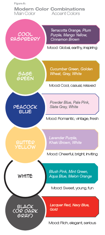
The next thing to consider is how these colors interact with each other when used in a scheme. When evaluating colors to use on a logo, in the design of a shop and in marketing efforts, first consider the emotions you want people to feel when they see them. If you feel that young people and kids are your main audience and want to attract their eye and make them happy, it would be easy to think you should use all warm colors. This may not be the best strategy though; for as cheerful and energetic as those colors are, when used all together they can create a sense of urgency and anxiety. This means customers may be drawn to your shop initially, but are just as likely to get in and get out, not leaving much time for you to build a relationship with them or up-sell additional items. You may be thinking, “Well, red and yellow worked for McDonald’s®, the most popular restaurant of all time; why not me?” But consider that the big burger chain has always balanced their cheerful bright logo with a variety of neutrals in each shop’s interior design, mostly browns and tans, that create an inviting enough environment for customers to linger once they’re inside. For your own twist, try pairing a cheerful, exciting yellow with an alluring cool tone like purple or blue or even a neutral like gray to create balance and harmony. See Figure A for more color combination ideas that you can use in your shop.

Color schemes are very susceptible to trends as you can witness in fashion, interior design, graphic design and Web design. Just think back to some of the more memorable eras and their color trends: The 1970s had avocado green, goldenrod yellow, rusty red and oak brown. The 1980s had their pastels like peach, mauve, taupe and seafoam green, and then the 1990s had jewel tones like emerald green, navy blue, ruby red and amethyst purple. Recently, popular color combinations have included colors like lime green and magenta; red, white and black; and aquamarine blue and brown to name a few. Again, people have emotional responses to color combinations based on experience, so just thinking about some of the color combinations above might elicit nostalgia and bring back memories of your family’s house from when you were younger.
Color is a very successful marketing vehicle in this way because it can bridge the gap between old and new very subtly with graphics that draw on a wider audience by being relatable to multiple generations. For example, when PepsiCo came out with their “throwback” line of soft drinks that were made with sugar instead of high fructose corn syrup, they needed some way to distinguish the special version from the regular version on the store shelf. Since the colors for Pepsi and Mountain Dew have been pretty much the same since their introductions, rather than changing the colors, they changed the way the colors were presented. The “throwback” designs featured more white space, reminiscent of their packaging from the 1970s, which coincidentally was the last time Pepsi was sweetened with sugar. This retro packaging attracted the attention of people who remembered drinking Pepsi sweetened with sugar in the 1970s and also a new cohort of consumers who wanted a chance to experience a blast from the past. Now that the “throwback” versions of the soft drinks have sustained popularity for long enough, they have been added to the regular product lineup and the packaging has changed again to be more consistent with the modern Pepsi image.
It just goes to show that people eat (and drink) with their eyes long before they ever select, purchase and consume the things they put into their bodies. This is your main opportunity to capture the imagination (and appetite) of your customers; let them see what you have to offer and make it look attractive. Just as mixing and matching colors from the wheel is important in your shop or restaurant’s décor, it should also be important in the items you present to your customers. There are two ways to do this well.
One way is to have the foods and drinks actually available for customers to view (think beautiful waves of fresh gelato in a display case or a grilled cheese sandwich and tomato soup combo plated under a glass dome at the counter). This may involve some shrinkage on your part, as the foods you have displayed should always look fresh and appetizing, meaning you will have to make “fake food” at least once daily. But it can really pay off when people can see what the food they are ordering will actually look like before they get it, like in a fancy restaurant when the waiter or waitress rolls out the dessert cart. Another way is to have nice photography of your foods on posters, table tents or menus in your shop. These photographs should be of professional quality and favorably represent the dishes you are serving. We’ve all been to restaurants before where each item on the menu has a photo (a plus) but all the photos look like the same brownish-red blobs with a sprig of parsley or dollop of sour cream on the top (yuck). Don’t forget when sourcing these pictures that PreGel AMERICA offers royalty-free imagery to customers, so that’s somewhere to start!
Natural colors and variety in food are often the most appetizing things you can offer to your customers. Depending on what mood or daypart you are catering to, these colors may vary. For example, someone who wants a healthy lunch might be looking for colors like bright greens, oranges and reds (like in a salad) or pale colors like white (sandwich bread, wraps, turkey, pasta or potato salad). Someone looking for a satisfying, indulgent meal would subconsciously seek out things that are golden brown (baked chicken, hot rolls, gravy, roasted potatoes) or red (soups, tomato sauce, steak, red peppers). After-dinner dessert-seekers might look for deep, rich colors like chocolate, wine, red velvet or coffee. Or those looking for a refreshing dessert or a snack might be envisioning light colors like peach, pink, champagne or mint. Although these are the typical visual cues that we draw from, people also tend to pause and evaluate foods that look strange or unexpected. For example, squid ink pasta and black sesame gelato could be seen as unappetizing because their color is too black; but the flavor is a mystery that can only be unraveled by taste, which can be very intriguing to adventurous eaters.
Overall, the biggest key to harnessing the power of color in your concept is balance. Look to nature as a guide, but also be willing to take a chance to create something new.
References:
Behr Process Corporation. (2011). Welcome to the Behr Virtual Color Centers. Retrieved July 2011, from Behr.com: http://www.behr.com/dsm-ext/v/index.jsp?vgnextfmt=default&vgnextoid=6bd8ea6621ca5110VgnVCM1000008119fea9RCRD&vgnextfmt=default#channel=INSPIRATION;vgnextoid=6bd8ea6621ca5110VgnVCM1000008119fea9RCRD;view=14
Bramen, L. (2009, April 14). The Plate as Palette. Retrieved July 2011, from Smithsonian Food & Thinnk: http://blogs.smithsonianmag.com/food/2009/04/the-plate-as-palette/
Escalate Media LP. (2003-2011). Colors for Marketing. Retrieved July 2011, from The v7 Network Web Development Community: http://www.v7n.com/colors-for-marketing.php
How Do Colors Affect Purchases? Infographic. (2011). KISSMetrics.
Morton, J. (2005). Why Color Matters, Color Theory. Retrieved July 2011, from Color Matters: http://www.colormatters.com/market_whycolor.html, http://www.colormatters.com/colortheory.html
Precision Intermedia. (2011). Color Psychology and Marketing. Retrieved July 2011, from Precision Intermedia: http://www.precisionintermedia.com/color.html
Steve. (2009, February 26). Official Facts About Pepsi Throwback & Mountain Dew Throwback. Retrieved July 2011, from BevReview.com: http://www.bevreview.com/2009/02/26/official-facts-about-pepsi-throwback-mountain-dew-throwback/
Tiger Color. (2000-2011). Basic Color Schemes – Introduction to Color Theory. Retrieved July 2011, from Tiger Color: http://www.tigercolor.com/color-lab/color-theory/color-theory-intro.htm