“Buy One Get One,” “Free!” and “For a Limited Time” are all promotional phrases seen everyday. From posters and commercials to emails, they have become part of the general population’s purchasing decisions and experience for years. Promotions are a great way to get new customers to try what you have to offer, or to keep your existing customers coming back for something new. The key to a successful promotional campaign is to get noticed, stir up a reaction and to make people compelled to act on that reaction, whether it is seeing a refreshing frozen beverage on a hot summer day or seeing an image of a decadent chocolate cake that they just can’t resist. There are plenty of design agencies that specialize in creating amazing visuals to draw people in, but getting those same results without the expense is something proprietors can handle themselves. It all comes down to understanding the basics of designing a successful, appealing visual campaign.
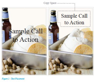 The first thing to consider is what is the first thing you want your customers to see. Is it one of the above-mentioned phrases? A product photo? Creating this sequence of information is called hierarchy. Consider what will attract attention and stop someone walking by in his or her tracks. This first thing you want someone to see is usually the largest element in the end product. This works best in the upper left corner or center; however, it can be placed in a more unusual location or position to intrigue the eye. The most important thing to remember when dealing with that main text or photo is that it should stand out. If placing text on top of a photo, look for an open area that will allow for maximum impact and visibility. Avoid placing text on top of photos if there is a wide range of colors as this visually blends them together and will create confusion for the eye. (See Figure 1)
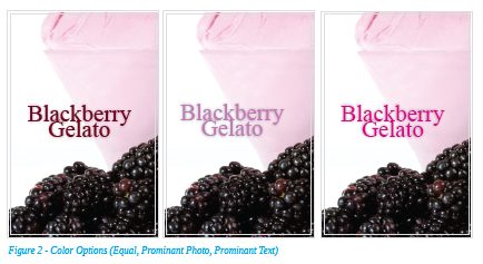 Balancing color usage is another way to create a high-impact promotional piece. If you are highlighting a seasonal flavor of gelato like blackberry, which is a deep red-violet, there are several different possible outcomes – using only color. Making your text shades of red or violet will create an equal effect between the elements and leave the hierarchy up to the viewer. Using a dark color like black, blue or a muted color will make the vibrancy of the gelato stand out from the background. This is because the red in the gelato has a longer wavelength (meaning it has a stronger visual presence to the eye and can be seen from further away). Warmer colors like red, orange and yellow have longer wavelengths than the cooler colors, making them more visible from further distances. Using bright, bold colors will attract attention to the text elements instead of the image element. Something as simple as considering the color choices can really make a dramatic difference in the success of promotional campaigns. Memory retention studies tell us that consumers are up to 78 percent more likely to remember a word or phrase printed in color than in black and white. The human eye is drawn to color. Color activates the right brain, while the printed word activates the left brain. When color is combined with the written word, it impacts consumers with the triple whammy of greater recall, recognition and attention.1 (See Figure 2)
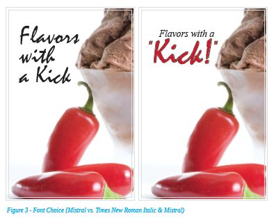 The final basic to consider would be font choices. Decorative fonts can really give your promotion a personality, but there are a few things to consider. The key is to use decorative fonts sparingly. If you’re featuring spicy flavors like Chili Chocolate or Mango Habanero, and your promotion headline is “Flavors With a Kick,” you will end up with a more successful poster or signage if just the word ‘Kick’ is in the decorative font. By using two different fonts, you draw more attention to one word and as a result people will see this one word out of the corner of their eye and stop to see what it’s all about. You will also create a more professional looking end product. (See Figure 3 for difference between the two scenarios.)
Helpful Tip:
Use Microsoft PowerPoint to lay out your designs vs. Microsoft word. The use of text boxes will allow for more options and control.
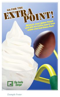 Beyond designing a visually appealing single piece, consider creating a strategic promotional campaign. For example, if your business is located next to a sports arena or concert hall, consider appealing to the traffic coming from that venue. Offering an “Extra Point” promotion to attract neighboring football fans is a great way to bring in some extra business. Use a simple and effective poster in the window with football-related imagery; you can even pair it with a special offer with their tickets, such as for every 6oz of frozen yogurt you get an extra ounce free! (See example poster on the right.)
Designing a promotional campaign can become more successful if reinforced through visual repetition. Even if you don’t have the opportunity to grab some attention from a sidewalk or street, or you just want to increase the visibility of your promotional campaign, this is a great device to utilize. A study published in the Journal of Consumer Research confirmed that consumers tended to think products advertised with repetition were good buys. Repetition may convince consumers that the manufacturer is willing to spend a lot of money on advertising because the product is a good one.2 With knowledge of how to design quality visuals, this same effect can be achieved without the cost. Placing small signage on several tables, counters and near registers can drastically help achieve these results. In this scenario, you don’t even have to be offering a special deal. Consider it a device to raise awareness of a new flavor or a customer favorite. You can either repeat the same image throughout your business, or create a campaign that uses different images and flavors but is unified by similar photos, text or colors. This is something you see in businesses from food service to retail, and beyond.
Having great photos is also a key to a successful promotional campaign. You can always hire a photographer with food styling experience, but there are resources out there that provide these same quality photos and a fraction of the cost. Stock photography sites allow you to purchase “royalty-free” (meaning you pay a flat fee, rather than a percentage going to a photographer each time the photo is used) images, illustrations and even videos. PreGel AMERICA also offers its customers a variety of royalty-free, professional images that include gelato, soft serve, pastry, raw ingredients, etc. These make creating dynamic promotional materials even easier.
With a few basic principles and an understanding of resources, a successful promotional campaign that turns heads and increases visibility is easier than it seems. And looking at the facts and the research, it is worth incorporating into your business and testing the waters. One final thing to remember is to pay attention to customers’ reactions and adjust your strategy accordingly. Also, remember to change your campaign regularly. Giving customers something fresh to look at may expose them to new products or bring new customers in who may have more of a connection with a new campaign as opposed to the previous one.
References:
1 Eiseman, L. (2000, April 17) Impact of color on consumer purchase behavior.
Article posted to www.scribd.com
2 Magloff, L. Repetition as an Advertisement Technique.
http://smallbusiness.chron.com/repetition-advertisement-technique-24437.html
